Understanding Forex Charts: Line, Bar & Candlestick Charts Explained
Every trade you place begins with reading a chart. Whether you’re buying EUR/USD, selling GBP/JPY, or analysing Gold, charts help you understand where prices have been, where they are now, and where they might go next. In this lesson, you’ll learn the three main types of Forex charts, how they work, and why candlestick charts have become the global standard for traders.
Learning Outcomes
- Understand what a Forex chart is.
- Learn why charts are essential for trading.
- Know the three main types of Forex charts.
- Understand the strengths and weaknesses of each chart type.
- Learn why professional traders prefer candlestick charts.
- Build the foundation for Technical Analysis and Price Action.
Table of Contents
- What Is a Forex Chart?
- Why Forex Charts Matter
- The Three Main Types of Forex Charts
- Line Charts Explained
- Bar Charts Explained
- Candlestick Charts Explained
- Comparing All Three Chart Types
- Common Beginner Mistakes
- Practice Exercise
- Frequently Asked Questions
- Lesson Summary
Imagine Driving Without a Windshield…
Imagine trying to drive a car while wearing a blindfold. You might know where you want to go, but without being able to see the road, every decision becomes a guess. Trading without a chart is very similar. Without a chart, you cannot see whether prices are rising, falling, or moving sideways. You have no visual representation of what the market has been doing, making every trading decision little more than speculation. A Forex chart acts as your window into the market. It transforms thousands of individual price updates into a visual story that you can analyse and understand.
Did You Know?
The Forex market updates prices continuously while it is open. Every second, buyers and sellers from around the world agree on new prices. A chart records these changes and presents them in a way that traders can easily interpret.
What Is a Forex Chart?
A Forex chart is a graphical representation of how the price of a currency pair changes over time. Instead of looking at an endless stream of numbers, traders use charts to quickly identify trends, market direction, important price levels, and potential trading opportunities. Every point, line, bar, or candlestick displayed on a chart represents price information collected over a specific period of time. For example, a chart may show how EUR/USD moved over the last hour, the last week, or even the past several years. The timeframe you choose determines how much market history is displayed and how detailed the price movements appear.
Simple Definition
A Forex chart is a visual record of how the price of a currency pair changes over a chosen period of time.
Why Are Forex Charts So Important?
Imagine trying to predict tomorrow’s weather without looking outside or checking a forecast. You would have very little information to base your decision on. Forex charts solve the same problem for traders. Rather than making random guesses, charts allow you to study historical price movements and observe how the market is behaving right now. While charts cannot predict the future with certainty, they provide valuable clues that help traders make more informed decisions.
Professional traders don’t rely on luck. They rely on information. Charts provide that information by revealing patterns, trends, momentum, and areas where buyers or sellers have previously entered the market.
Charts Help Traders Answer Questions Like:
- Is the market moving higher or lower?
- Is the current trend strong or weak?
- Where have buyers entered before?
- Where have sellers taken control?
- Should I consider buying, selling, or waiting?
Important
Charts do not tell traders exactly what will happen next. Instead, they help traders understand probabilities. The goal is not to predict the future perfectly but to make better-informed trading decisions based on the information currently available.
The Three Main Types of Forex Charts
Although there are several specialised chart styles available on some trading platforms, nearly every Forex trader uses one of three main chart types. Each displays the same market information but in a different way. Understanding the strengths and weaknesses of each chart type will help you choose the one that best fits your trading style.
| Chart Type | Best For | Popularity |
|---|---|---|
| Line Chart | Viewing the overall market trend. | ★★☆☆☆ |
| Bar Chart | Displaying detailed price information. | ★★★☆☆ |
| Candlestick Chart | Reading price action and market sentiment. | ★★★★★ |
In the following sections, we’ll examine each chart type individually, explain how it works, and discuss when traders choose to use it.
Line Charts Explained
A Line Chart is the simplest type of Forex chart. Instead of displaying every price movement, it connects a series of closing prices with a continuous line. This creates a clean and easy-to-read view of how the market has moved over a chosen period. Because it only uses one price point from each time period—the closing price—it removes much of the market “noise” and allows traders to focus on the overall direction of price.
How a Line Chart Works
Imagine EUR/USD closes at the following prices over five consecutive hours:
- Hour 1 — 1.1000
- Hour 2 — 1.1015
- Hour 3 — 1.1010
- Hour 4 — 1.1030
- Hour 5 — 1.1045
A Line Chart simply connects these closing prices together using a single continuous line. The result is a smooth curve that shows the market’s overall direction.
Think of It Like This
Imagine you’re hiking up a mountain. If you only looked at your position every hour, you could draw a line showing your overall journey without recording every step you took along the way. That’s exactly what a Line Chart does—it shows the journey, not every small movement.
Advantages of Line Charts
- Very easy to understand for beginners.
- Clearly shows the overall market trend.
- Removes short-term price fluctuations that may distract traders.
- Useful for identifying long-term market direction.
- Simple and uncluttered appearance.
Disadvantages of Line Charts
- Does not display the opening price.
- Does not display the highest price reached.
- Does not display the lowest price reached.
- Provides less information than Bar or Candlestick Charts.
- Not ideal for detailed technical analysis.
Important
Although Line Charts are excellent for identifying trends, they hide a large amount of valuable price information. Professional traders rarely rely on Line Charts alone when making trading decisions.
What Is a Bar Chart?
A Bar Chart provides much more information than a Line Chart. Instead of showing only the closing price, each bar displays four important pieces of market data for a specific period. These are commonly referred to as the OHLC prices:
- Open – The price where the period began.
- High – The highest price reached during the period.
- Low – The lowest price reached during the period.
- Close – The final price when the period ended.
Because Bar Charts display all four prices, they provide a much more complete picture of market activity than Line Charts.
Imagine One Hour of Trading
Suppose EUR/USD produces the following prices during one hour:
| Price | Value |
|---|---|
| Open | 1.1000 |
| High | 1.1030 |
| Low | 1.0990 |
| Close | 1.1025 |
A single bar represents all four of these prices at once, giving traders far more information than a simple line.
Did You Know?
Bar Charts were widely used by professional traders long before Candlestick Charts became popular in Western financial markets. Even today, some institutional traders still prefer them because they present detailed price information in a compact format.
Advantages of Bar Charts
- Shows all four OHLC prices.
- Provides more information than a Line Chart.
- Useful for analysing market volatility.
- Helps identify trend strength.
- Popular among experienced traders.
Disadvantages of Bar Charts
- Can appear confusing to beginners.
- Harder to read than Candlestick Charts.
- Patterns are less visually obvious.
- Requires more experience to interpret correctly.
Quick Comparison
If a Line Chart tells you where price has been, a Bar Chart tells you how price behaved during each trading period.
Understanding OHLC
Whether you’re looking at a Bar Chart or a Candlestick Chart, the same four prices are always being displayed:
- Open — The first traded price during the selected time period.
- High — The highest price reached before the period ended.
- Low — The lowest price reached before the period ended.
- Close — The last traded price when the period finished.
These four prices tell the complete story of what happened during a particular candle or bar. Every technical analysis strategy you’ll learn later in the academy is built upon understanding these four values.
Professional Insight
Professional traders often pay special attention to the closing price because it represents where buyers and sellers finally agreed on value before the trading period ended. Many important trading decisions are based on where a candle or bar closes rather than where it briefly moved during the session.
Why Most Traders Prefer Candlestick Charts
Although Line Charts and Bar Charts both provide useful information, neither has become the global standard for modern Forex trading. That title belongs to Candlestick Charts. Candlestick Charts display exactly the same OHLC information as Bar Charts, but they present it in a much more visual and intuitive way. At a quick glance, traders can immediately recognise whether buyers or sellers controlled the market during a particular period. This is one of the main reasons why Candlestick Charts have become the preferred choice for traders around the world.
Coming Up Next
In the next section, we’ll take a deep dive into Candlestick Charts. You’ll learn how each candlestick is formed, what its body and wicks represent, why different colours matter, and why mastering candlesticks is one of the most important skills every Forex trader can develop.
Why Candlestick Charts Are the Most Popular
If Line Charts, Bar Charts, and Candlestick Charts all display price information, you might wonder why almost every professional trader chooses candlestick charts. The answer lies in one simple word: clarity. Candlestick charts make it much easier to understand what is happening in the market. Instead of studying numbers or thin bars, traders can immediately see whether buyers or sellers were stronger during each trading period. This visual advantage allows traders to analyse the market more quickly and make decisions with greater confidence.
Imagine Reading a Book…
Suppose you had two versions of the same book. One version contains only plain text. The other includes headings, colours, diagrams, and illustrations that make the information easier to understand. Both books contain exactly the same information. However, most people would find the illustrated version easier to read. Candlestick charts work in a similar way. They display the same OHLC information as Bar Charts but present it in a much clearer and more visual format.
Why Professional Traders Prefer Candlesticks
- They clearly show whether buyers or sellers controlled each trading period.
- They make trends easier to identify.
- They reveal market sentiment almost instantly.
- They help traders recognise price patterns more easily.
- They are supported by nearly every trading platform.
- Most technical analysis strategies are designed around candlestick charts.
Professional Insight
If you ever watch experienced Forex traders analysing charts, you’ll notice that almost all of them use candlestick charts. Whether they’re trading currencies, stocks, commodities, or cryptocurrencies, candlesticks have become the universal language of technical analysis.
Comparing All Three Chart Types
Now that you’ve learned how each chart works, let’s compare them side by side. Although all three display price movement, they serve different purposes.
| Feature | Line Chart | Bar Chart | Candlestick Chart |
|---|---|---|---|
| Easy for Beginners | ★★★★★ | ★★☆☆☆ | ★★★★★ |
| Shows Open Price | ❌ | ✅ | ✅ |
| Shows High Price | ❌ | ✅ | ✅ |
| Shows Low Price | ❌ | ✅ | ✅ |
| Shows Close Price | ✅ | ✅ | ✅ |
| Best for Technical Analysis | ⭐ | ⭐⭐⭐ | ⭐⭐⭐⭐⭐ |
| Popularity Among Traders | Low | Medium | Very High |
Simple Summary
- Line Charts help you see the overall trend.
- Bar Charts provide detailed price information.
- Candlestick Charts combine detailed information with excellent visual clarity.
Which Chart Should Beginners Use?
As a beginner, it’s helpful to understand all three chart types because you’ll encounter each one at some point in your trading journey. However, if you plan to become a serious Forex trader, you should spend most of your time learning candlestick charts. They are easier to interpret than Bar Charts and provide far more information than Line Charts. More importantly, almost every lesson you’ll study later in the Tradexly Pro Academy—from support and resistance to candlestick patterns and price action—will be taught using candlestick charts. Learning them now will make future lessons much easier.
Our Recommendation
| If Your Goal Is… | Recommended Chart |
|---|---|
| Understanding overall trends | Line Chart |
| Learning detailed price movement | Bar Chart |
| Becoming a successful Forex trader | Candlestick Chart |
Looking Ahead
Don’t worry if candlesticks still seem a little confusing. In the very next lesson, we’ll study candlesticks in much greater detail. You’ll learn how to recognise individual candle formations, understand what they reveal about market psychology, and begin identifying some of the most important candlestick patterns used by professional traders.
Common Beginner Mistakes
Learning to read charts takes time. Most beginners make similar mistakes when they first start analysing price movement. Recognising these mistakes early can help you avoid unnecessary frustration and build better trading habits.
1. Changing Chart Types Constantly
Some new traders switch between Line Charts, Bar Charts, Candlestick Charts, Heikin Ashi, Renko, and several other chart styles every few minutes. Instead of improving their analysis, this often creates confusion. Choose one chart type—preferably candlesticks—and become comfortable with it before experimenting with others.
2. Ignoring the Bigger Picture
Many beginners become so focused on individual candles that they forget to look at the overall trend. Always analyse the broader market before paying attention to small price movements. A single candle rarely tells the entire story.
3. Believing Every Candle Predicts the Future
Candlesticks provide valuable information about what buyers and sellers have done. They do not guarantee what will happen next. Successful traders use candlesticks together with trend analysis, support and resistance, risk management, and sound trading discipline.
4. Focusing Only on Colours
Some beginners think every green candle means “buy” and every red candle means “sell.” In reality, context matters far more than colour. A green candle appearing at resistance may tell a completely different story from a green candle appearing during a strong breakout.
5. Rushing Into Technical Analysis
Many traders try to memorise dozens of chart patterns before understanding how a single candlestick works. Build your knowledge step by step. A strong foundation will make advanced concepts much easier to learn later.
How to Read a Candlestick Like a Professional Trader
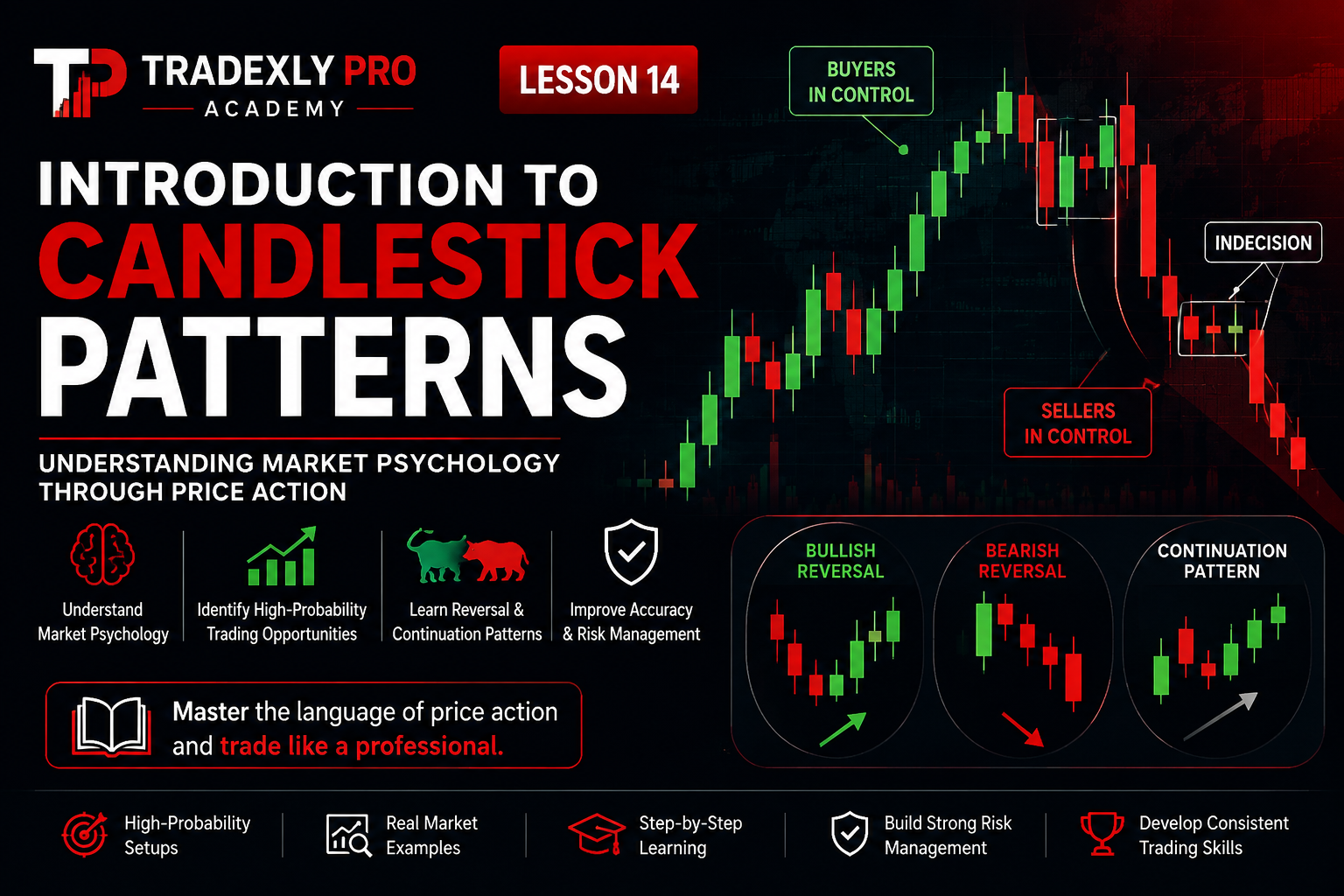
One of the biggest mistakes beginners make is looking at a candlestick and asking only one question: “Is it green or red?” Professional traders think very differently. Instead of focusing only on the colour, they try to understand the story behind the candle. Every candlestick represents a battle between buyers (bulls) and sellers (bears). The shape of the candle tells us who was stronger, who lost control, and how confident each side was during that trading period. Learning to read this story is one of the most valuable skills you’ll develop as a trader.
Every Candlestick Tells a Story
Imagine watching a football match. Looking only at the final score tells you who won, but it doesn’t tell you how the game unfolded. Perhaps one team dominated possession but couldn’t score. Maybe the winning goal came in the final minute. A candlestick works the same way. The opening price, closing price, highest price, and lowest price reveal everything that happened during that period—not just the final result.
The Battle Between Buyers and Sellers
The Forex market moves because buyers and sellers constantly disagree on what a currency pair is worth. When buyers become stronger, prices rise. When sellers become stronger, prices fall. Every candlestick captures this struggle. Let’s look at how different candles reveal different market emotions.
Scenario 1: Buyers Dominate
Imagine EUR/USD opens at 1.1000. Throughout the hour, buyers continue purchasing the currency pair. The price rises steadily and closes at 1.1060. This creates a large bullish candlestick. What does this tell us?
- Buyers controlled most of the trading session.
- Sellers were unable to stop the upward movement.
- Buying pressure was strong.
- Market sentiment during that period was positive.
Scenario 2: Sellers Take Control
Now imagine GBP/USD opens at 1.2800. During the next hour, sellers overwhelm buyers. The market falls steadily before closing at 1.2735. This creates a large bearish candle. From this single candle, traders can immediately see that sellers dominated the session.
Scenario 3: Neither Side Wins
Sometimes buyers push prices higher while sellers push them lower, but neither side gains lasting control. The market finishes very close to where it started. The result is a very small-bodied candle. These candles often suggest hesitation, uncertainty, or a temporary balance between buyers and sellers.
Why the Closing Price Matters Most
Although every price on a candlestick is important, experienced traders often pay the closest attention to the closing price. Why? Because the closing price represents the final agreement between buyers and sellers before that trading period ends. It tells us who had control when the “battle” finished. A market may rise sharply during the hour, but if sellers push the price back down before the candle closes, that information is extremely valuable. Likewise, a market may fall significantly before buyers recover and force the candle to close much higher. The closing price often provides a clearer picture of market sentiment than the highs and lows alone.
Professional Insight
Many trading strategies wait for a candle to close before making any decision. This is because a candle can change dramatically while it is still forming. A candle that appears strongly bullish halfway through the hour could eventually close as a bearish candle if sellers regain control before the session ends. Patience is one of the habits that separates professional traders from emotional traders.
How Timeframes Change the Story
One concept that often confuses beginners is that the same market can produce completely different candlesticks depending on the timeframe being viewed. This doesn’t mean the charts are wrong. It simply means each timeframe is summarising price movements over a different length of time.
An Example
Imagine EUR/USD rises steadily over four hours. If you view the market on a 1-Hour Chart, you’ll see four separate candlesticks, each representing one hour of trading. However, if you switch to a 4-Hour Chart, those same four candles are combined into a single candlestick. Both charts are correct—they’re simply showing the same information from different perspectives.
| Timeframe | Each Candle Represents |
|---|---|
| 1 Minute (M1) | 1 minute of trading activity |
| 5 Minutes (M5) | 5 minutes of trading activity |
| 15 Minutes (M15) | 15 minutes of trading activity |
| 1 Hour (H1) | 1 hour of trading activity |
| 4 Hours (H4) | 4 hours of trading activity |
| Daily (D1) | One full trading day |
| Weekly (W1) | One trading week |
| Monthly (MN) | One calendar month |
Important
A candlestick should always be interpreted within the timeframe you’re analysing. A bullish candle on the 5-minute chart may simply be a small pullback inside a strong downtrend on the Daily chart. This is why experienced traders often analyse multiple timeframes before placing a trade.
Practising Your Candlestick Reading Skills
The best way to become comfortable reading candlesticks is through observation. Open a demo account on MetaTrader 5 or TradingView and simply watch how candles form in real time. Instead of rushing to place trades, ask yourself questions such as:
- Who controlled this candle—buyers or sellers?
- Is the body large or small?
- Are the wicks long or short?
- Did the candle close strongly or weakly?
- How does it compare with the previous candles?
After repeating this exercise regularly, you’ll begin to recognise market behaviour much more naturally. Over time, you’ll stop seeing candles as shapes and start seeing them as stories about supply, demand, confidence, fear, and momentum. That’s exactly how professional traders think.
Tradexly Pro Tip
Don’t try to memorise dozens of candlestick patterns yet. First, become comfortable understanding what a single candlestick is telling you. Once you can confidently read one candle, recognising groups of candles and advanced candlestick patterns becomes much easier. We’ll cover those in the next lesson of the Tradexly Pro Academy.
Using Forex Charts on Trading Platforms
Now that you understand how Forex charts work, the next question is: Where do traders actually use these charts? The answer is simple. Every trading platform displays price using charts. Whether you’re analysing EUR/USD on your computer or checking Gold prices on your phone, you’ll almost always be looking at a chart. Although different platforms have slightly different designs, the basic principles remain exactly the same. Once you learn how to read one chart, you’ll be able to analyse charts almost anywhere.
The Most Popular Trading Platforms
| Platform | Common Use |
|---|---|
| MetaTrader 4 (MT4) | Forex and CFD Trading |
| MetaTrader 5 (MT5) | Forex, Stocks, Indices and Commodities |
| TradingView | Chart Analysis and Market Research |
| Broker Web Platforms | Trading directly through a web browser |
Regardless of which platform you choose, you’ll notice that candlestick charts are usually selected by default. That’s because they provide the clearest picture of market activity.
Professional Insight
As you continue through the Tradexly Pro Academy, we’ll primarily use candlestick charts on MetaTrader 5 and TradingView because these are among the most popular platforms used by traders worldwide. If you’re following along using another platform, don’t worry—the concepts you’ll learn remain exactly the same.
How Professional Traders Read Charts
Beginners often stare at charts hoping they’ll magically reveal where the market is going next. Professional traders approach charts very differently. Instead of trying to predict every movement, they use charts to answer a series of logical questions. By asking the right questions, they can better understand the current market conditions before risking any money.
Questions Professionals Ask
- Is the market trending upward, downward, or moving sideways?
- Are buyers or sellers currently in control?
- Is momentum increasing or slowing down?
- Has the market reached an important support or resistance level?
- Is there enough evidence to justify entering a trade?
- What is my risk if this trade goes wrong?
Notice that none of these questions involve guessing. Professional trading is based on analysing probabilities, managing risk, and waiting patiently for high-quality opportunities. Charts provide the information needed to answer these questions objectively.
A Common Misconception
Many new traders believe experienced traders can predict exactly what the market will do next. In reality, no one can consistently predict the future. Even the world’s best traders experience losing trades. The difference is that professionals manage risk carefully and make decisions based on evidence rather than emotion.
Practice Exercise
Before moving on to the next lesson, spend a few minutes applying what you’ve learned. The goal isn’t to make money yet. It’s simply to become comfortable reading charts and understanding what they are communicating.
Exercise 1
- Open a demo account using MetaTrader 5 or TradingView.
- Open the EUR/USD currency pair.
- Switch between the Line Chart, Bar Chart, and Candlestick Chart.
- Observe how the same market looks different on each chart type.
- Return to the Candlestick Chart.
- Identify five bullish candles and five bearish candles.
- Look for candles with long upper or lower wicks.
- Write down what you think buyers and sellers were doing during each candle.
Exercise 2
Choose three different timeframes—for example, the 15-minute, 1-hour, and Daily charts. Compare the market on each timeframe. Ask yourself:
- Does the trend look the same on every timeframe?
- Which timeframe appears stronger?
- Which timeframe contains the most market noise?
- Can you identify the same bullish and bearish candles across different timeframes?
This simple exercise will help you understand why experienced traders often analyse more than one timeframe before making trading decisions.
Key Takeaways
- A Forex chart is a visual representation of price movement over time.
- Charts help traders understand trends, momentum, and market behaviour.
- There are three main chart types: Line Charts, Bar Charts, and Candlestick Charts.
- Line Charts display only closing prices.
- Bar Charts display the Open, High, Low, and Close (OHLC).
- Candlestick Charts display the same OHLC information but in a much clearer and more visual format.
- The body of a candlestick shows the relationship between the opening and closing prices.
- The wicks reveal the highest and lowest prices reached during the trading period.
- Professional traders read the story behind each candle rather than focusing only on its colour.
- Different timeframes display the same market from different perspectives.
- Reading charts is a skill that improves through observation and consistent practice.
Frequently Asked Questions
Which chart type is best for beginners?
Candlestick Charts are the best choice for most beginners because they clearly display all the important price information while remaining easy to understand.
Can I trade successfully using only Line Charts?
Although it’s possible, most traders prefer Candlestick Charts because they provide much more information for analysing market behaviour.
Do all trading platforms use the same charts?
Yes. While the appearance of platforms may differ slightly, the principles behind Line Charts, Bar Charts, and Candlestick Charts remain the same across nearly all trading platforms.
Should I memorise candlestick patterns now?
Not yet. Before learning patterns, you should first understand how individual candlesticks work. A solid foundation will make pattern recognition much easier in the next lesson.
Can one candlestick predict the future?
No. A single candlestick only tells the story of one trading period. Successful traders analyse multiple candles, market structure, trends, and other technical factors before making trading decisions.
Final Thoughts
Every successful Forex trader begins by learning to read charts. At first, charts may seem like nothing more than lines, bars, and coloured candles. However, with practice, you’ll begin to see something much more important—the ongoing battle between buyers and sellers. Remember, charts don’t predict the future. They provide clues about what the market has already done and what it may be preparing to do next. The more time you spend observing price action, the more naturally you’ll begin to understand the language of the market. Master this foundation, and every lesson that follows in the Tradexly Pro Academy will become easier to understand.